About
Komorebi
Digital Design, Grounded in Purpose.


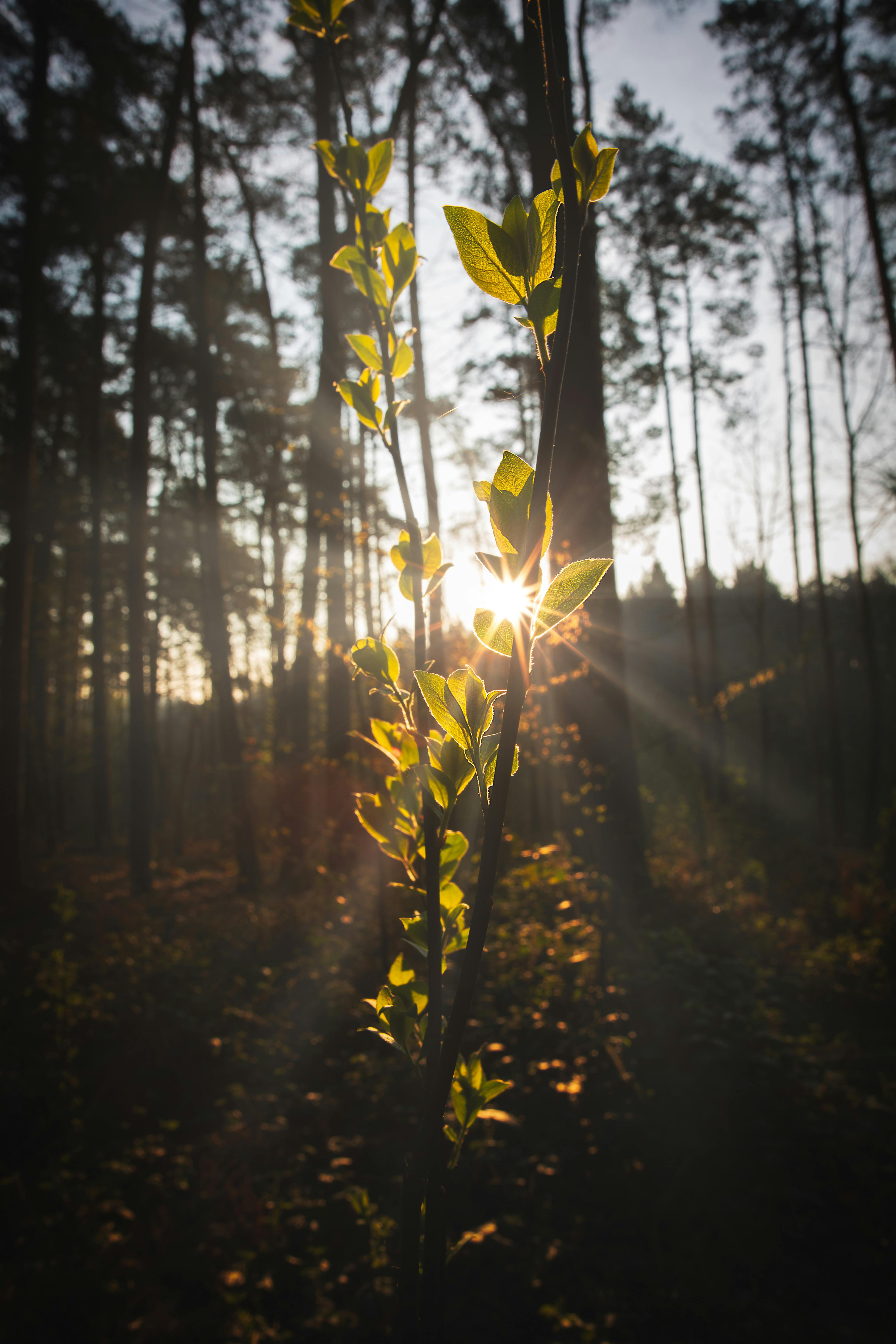
The name Komorebi (木漏れ日) describes the way sunlight filters through leaves — small, dappled, alive. A kind of beauty that only shows itself when the world slows down.
The Ginkgo leaf anchors the brand: a tree known for centuries of quiet endurance. Both choices remind me what I'm trying to build, design work that respects the moment and outlasts it.

Resilience • 靭
"Built to last longer than a trend."

Clarity • 明
"Removing what doesn't need to be there."

Harmony • 和
"Where craft and care meet."
Purpose • 意
"Every choice answers a question."

Connection • 関
"Designed for the person behind the screen."
FAQ.
Make a quieter difference.
Cut the noise. Build a space that makes you and your audience more human, not less.